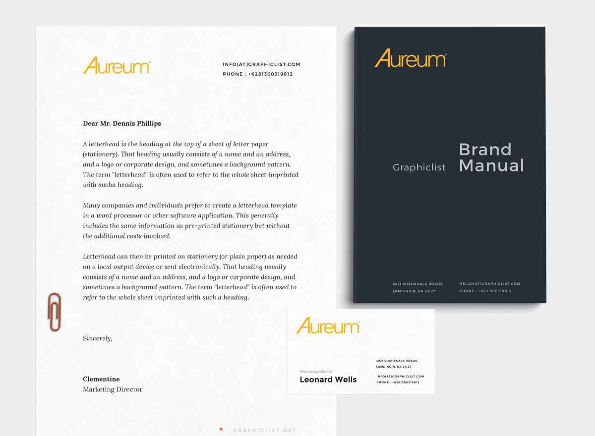
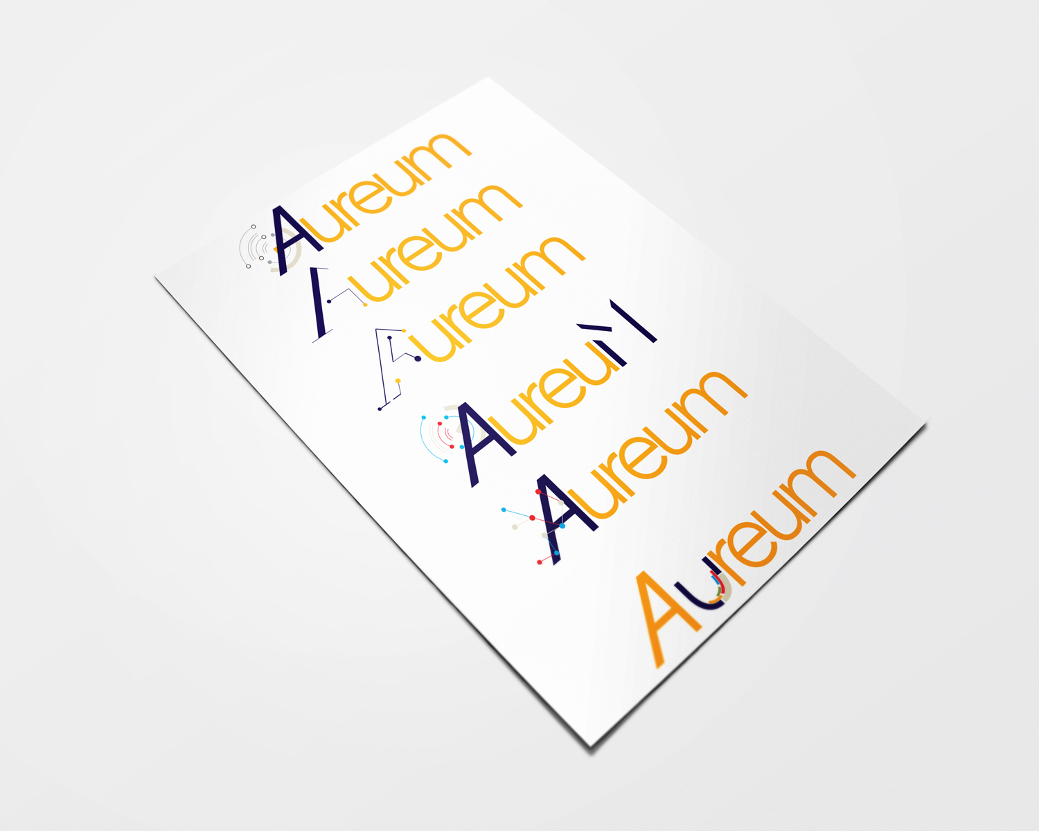
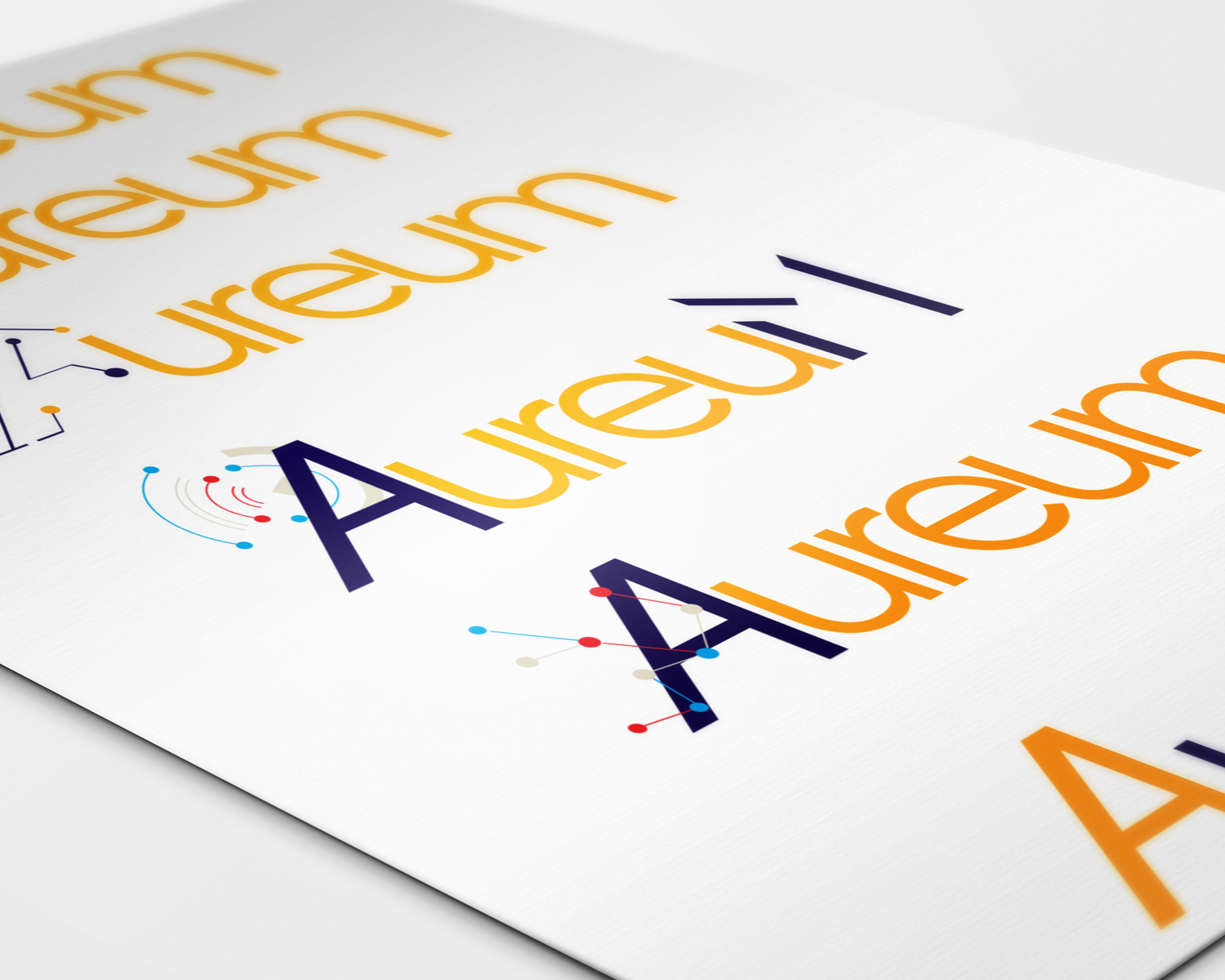
Aureum logo.
The product Hyperfiller was changed to Aureum, it means gold in Greek. The design requirement was, the color of the logo needs to be flat, related to gold and it should have simple font treatment.
After many iteration, they decided to go with the simple logo with slanted "A".